Brutalism in Web Design: Bold Aesthetic or Just Bad UX?
BrightStack Digital explores the rise of brutalist web design and whether it works for modern businesses.

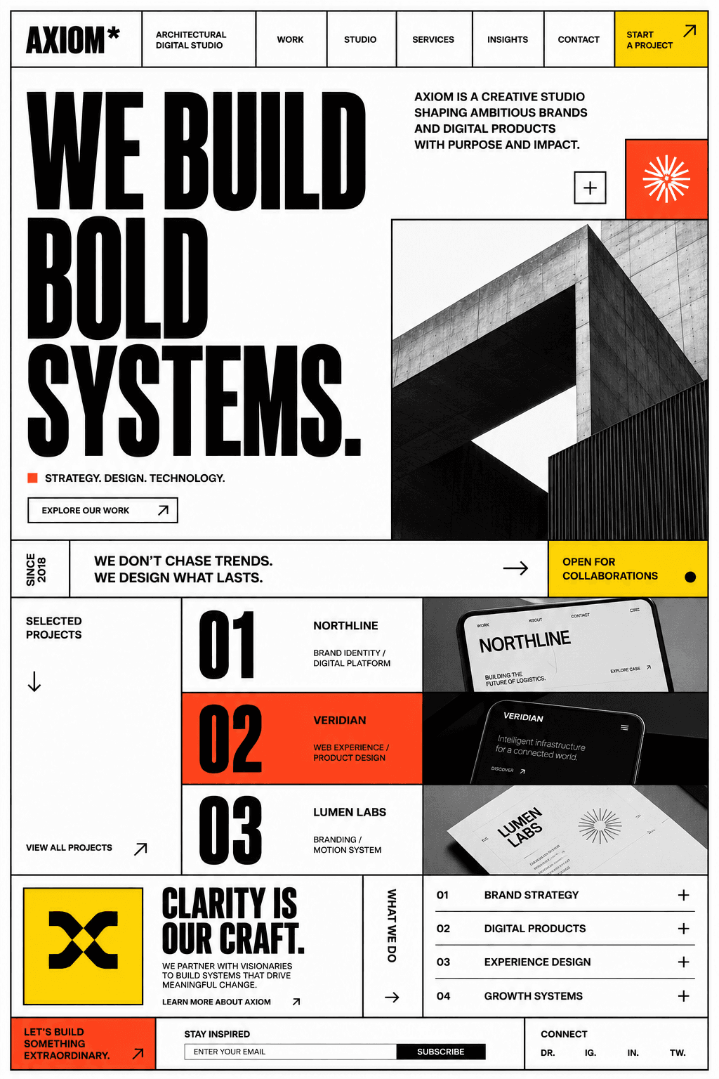
Brutalist web design uses raw structure, forceful typography and visible interface mechanics to reject the smooth sameness of many digital products. It can create a memorable identity, but boldness does not excuse confusion.
The strongest brutalist sites understand conventional usability and break selected rules with purpose. The weakest use visual disruption everywhere, leaving visitors to decode the interface before they can reach the content.
What brutalism looks like on the web
Common ingredients include oversized type, hard borders, exposed grids, limited colour palettes and controls that look deliberately mechanical. Spacing may be abrupt and hierarchy may feel more like a poster than a conventional marketing page.
None of those choices define the style on their own. Brutalism is more about attitude: showing the structure, removing polite decoration and allowing the content to feel direct.
Why the aesthetic can feel refreshing
Many websites rely on the same soft cards, gradients and rounded controls. A rawer direction can help an editorial, cultural or design-led brand feel distinct. It can also place more emphasis on words and composition than on decorative polish.
Directness can build character when it reflects the organisation behind the site. A bold system feels convincing when the copy, imagery and interaction style all support the same point of view.
Where bold design becomes bad UX
A visitor still needs to recognise navigation, understand what is clickable and follow the content in a sensible order. When every element demands equal attention, the page loses hierarchy. When controls change shape or location without reason, the experience becomes tiring.
Unreadable contrast, tiny labels and excessive motion are not more authentic because the style is brutalist. They are simply barriers. Accessibility remains part of the design brief.
Use the principles instead of copying the costume
A business does not need a fully brutalist interface to benefit from its confidence. One oversized headline, a visible grid, a stricter palette or a more direct button treatment can add tension without sacrificing familiar navigation.
Restraint makes the expressive moments stronger. If the structure remains predictable, unusual typography and composition have more room to create impact.
Questions to ask before choosing the style
- Does this visual direction reflect the brand's actual personality?
- Can a first-time visitor still identify the main action quickly?
- Does the hierarchy remain clear on a small screen?
- Are text, controls and focus states accessible?
- Will the content team be able to maintain the system consistently?
Boldness needs a reason
Brutalism can produce a powerful website when the brand benefits from its honesty and visual tension. It becomes bad UX when the aesthetic is treated as permission to ignore clarity. The goal is not to make the interface polite. It is to make every deliberate break support the story rather than obstruct it.
Let’s keep in touch.
Follow me on LinkedIn and X for more on thoughtful, high-performance web design and digital craft.