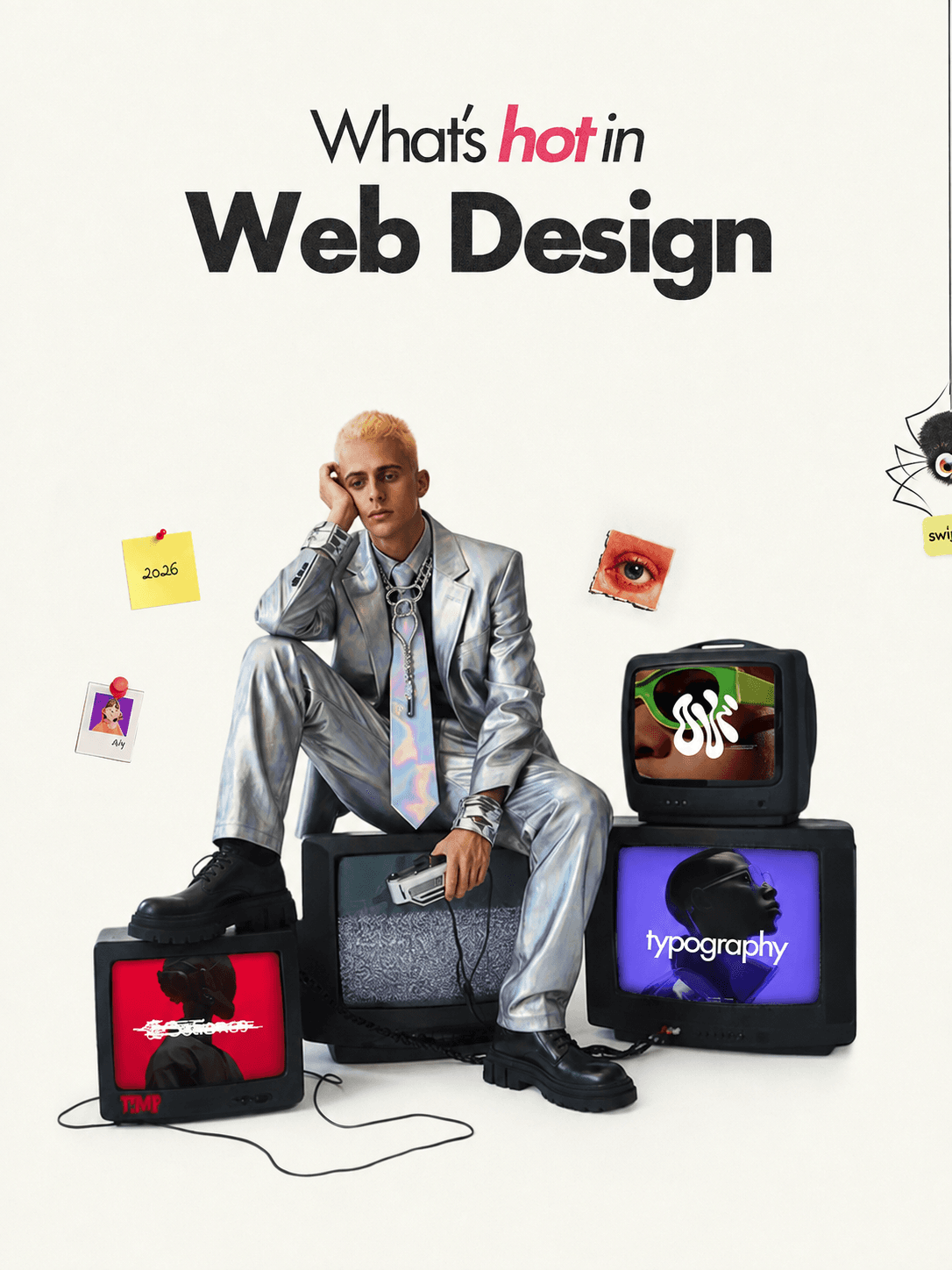
How a well designed website can transform your business
Discover the latest design trends shaping the digital world and how they impact business.

Web design trends are useful when they improve clarity, interaction or the way a brand communicates. Being fashionable is not enough on its own.
The most valuable shifts are rarely about copying a particular layout or effect. They reflect a broader change in what people expect from a website: a clear point of view, fast access to useful information and an experience that feels considered on every screen.
Editorial layouts are becoming more expressive
Large typography, asymmetric composition and deliberate whitespace are giving websites a stronger editorial character. These choices can help a business communicate confidence and make important ideas easier to notice.
Expression still needs structure. A dramatic heading only works when the supporting message is easy to follow, and an unusual grid still needs to guide the eye in a sensible order. The best editorial layouts feel distinctive without making visitors work to understand them.
Motion is becoming more purposeful
Movement is increasingly being used to explain relationships and direct attention. A small transition can show that a card is interactive, reveal the next part of a story or make a change in state easier to understand.
Purpose matters more than quantity. When every section moves, the page becomes tiring and the important moments lose impact. Restrained motion feels more confident, performs better and remains comfortable for people who prefer reduced movement.
Interfaces are becoming cleaner, not emptier
Minimal design is still influential, but empty space alone does not create clarity. A clean interface needs strong hierarchy, useful content and enough personality to feel connected to the business behind it.
This often means fewer competing elements, more intentional type scales and clearer decisions about what belongs on each page. The result should feel focused rather than unfinished.
Mobile experience is part of the design from the beginning
Responsive design is moving beyond shrinking a desktop layout after the main work is finished. Content order, navigation, touch targets, image crops and loading priorities all need to be considered from the start.
A strong mobile experience often reveals whether the underlying design decisions are sound. With less space available, unclear messaging and unnecessary elements become obvious quickly.
AI is changing the workflow, not replacing the thinking
AI can speed up early exploration, content organisation and repetitive production work. It can help compare directions, surface alternatives and reduce time spent on mechanical tasks.
The decisions that make a website useful still need human judgement. Someone has to understand the business, recognise what matters to its audience and decide which ideas support the message. Faster output is valuable only when it leads to a better result.
Use trends as tools
A trend can be a useful reference, but it should never become the reason a website exists. The right choices are the ones that support the business, make the experience clearer and help people move forward with confidence.
Let’s keep in touch.
Follow me on LinkedIn and X for more on thoughtful, high-performance web design and digital craft.